Week 1: ending 20th March
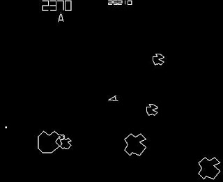
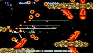
Quiet week, researched into the bullet hell games and shooters in general, analysing their mechanics and how they play. Examples of the games I looked at include Touhou Project, Realm of the Mad God and Asteroids.
Currently up to date with my plan.
Week 2: ending 27th March
Research was concluded after I had looked up on potential themes I could use with my art direction and settled for the medieval fantasy. Decided to come up with ideas first based on what I have gathered before creating the base game that only consist of the character that can shoot when the X key is pressed and an enemy that continuously shoots a bullet every second. I also chose the arrow keys over the WASD keys to
I also got the boss some fairly complicated movements as well by using different variables and walls to create this limited random AI.
Week 3: ending 17th April
Created a majority of my assets including tiles that will spawn together to create an endless moving background, the character is created as a flying wizard whilst the boss is a wizard as well except he's flying on a nimbus cloud and my final choice after looking through my other flying platform ideas.
Half of my current planned assets done and still up to date with my plan.
This blue robed wizard is the player character. I have his whole body lying forward with his arms behind all with a drop shadow below to show that they're flying and above ground.
This blue robed wizard is the player character. I have his whole body lying forward with his arms behind all with a drop shadow below to show that they're flying and above ground.
These next two images make up the boss character. I had considered the boss to be in a similar pose to the player character but decided against it since it would look weird for the boss to fly in that pose so I decided that he'll be standing upright, however, even in that pose something was missing which was that he seemed like he was on the ground, so I came up with flying platforms for the boss after looking at fantasy floating islands and magic circles and finally ended with a nimbus cloud as the final platform due to how menacing on can be and that clouds are objects that naturally float in the sky.
These four images are some examples of my moving background assets that will tile together and will loop randomly between each one so it adds to the feeling of the characters moving.
Week 4: ending 24th April
Finished with the last set of assets, bullets, power ups, etc.
Green bullets represent boss bullets with the big orb with rings being additional armaments for the boss to shoot extra bullets, red bullets represent player bullets as well as the star being his homing shots, the meteor is the bomb icon or what clears the bullets on screen.
Also up to date this week.
The star was my design choice for homing bullets because of how ninjas accurately throw their shurikens at their opponents and because they're shaped similarly to pointed stars, I felt it was appropriate to use compared to vector drawn thunderbolts.
Also up to date this week.
Enemy Bullet
Player Bullet
Both the player character's main bullets are the same shape but different with colour differences to distinguish the two apart.
Bomb Icon
I had the decision to use either and actual black round bomb as the icon for clearing every on screen bullet or I'd use a meteor icon. I chose the meteor icon because it fit the wizard theme more than the bomb did, although a bomb would definitely be better than the meteor if my player character was an archer or a rouge instead.
Boss Orb
I chose to give the boss this armament as to increase the spread of the bullets over a wider area instead of limiting the shot direction from the boss itself.
Player Homing Bullet
________________________________________________
Homing Powerup
Bullet Powerup
For this power up and the basic one, the final choice I made for them was to put them into boxes so they can be distinguished differently than the actual bullets on screen.
Life Icon
I chose the standard heart icon for lives as for a game like this where the character can get defeated in 1 shot, an icon to represent the lives would definitely be better than a health bar.
Week 5: ending 1st May
Started creating the game from the base I have created the extra components for the player character such as the homing bullets. I also HUD. The HUD itself doesn't have a fancy layout as the focus for me was to get the game working along with my assets.
Here we have the icons for the bombs, lives, power-ups and both the regular score and survival score.
The regular score and survival score are both get a point every second but the regular score is also influenced by hits on the boss (+1 Point) and power-up pickups (+100 points).
Here is the event sheet for the bombs. The bombs and lives work similar to each other but the lives trigger upon the player character hit box getting hit and the bombs activate on the press of a button.
I have also gotten the basic shots to work, as well as giving a homing behaviour to another set.
Fairly easy to do except figuring out how to create the homing behaviour, but after looking at various tutorials, I figured something out and managed to complete what I've stated in my plan for this week.
Week 6: ending 8th May
I got the background assets to tile and move from right to left as well as getting them to spawn randomly. I had difficulty trying to sort out a bug where two of the background assets overlap with each other.
As for the power-up drops, I had figured out a way for them to spawn at different damage intervals but at the moment there is a bug where it occasionally spawns 10 or so in one instance but otherwise, the intervals vary on the damage dealt to the boss and state of the player character.
Somewhat up to date at this point but however, there are still these bugs with these mechanics so I'll need to clear them near the end if I have time since luckily they aren't game breaking.
Week 7: ending 15th May
I had lost half of the game over the weekend due to carelessness with my memory stick but I've managed to rebuild it fairly quickly since I had backups to the assets and screenshots of my previous builds.
Unfortunately due to this I'll be limited in what I can do due to the nearing deadline so no extras can be added but I've at least cleared a few of the bugs, but the power-up drop bug still occurs but less frequently. Also because of this, I'm behind my plan and will need to sort out parts of my game through the evaluation week.
All in all I added a game over screen displaying how long you've survived in seconds and the overall score. If I had more time, I would've also added a table of the top 10 scores.
The problem with the background overlap was because my randomiser was an instance variable that targeted a family but, when I changed it to a local variable, I managed to prevent it from occurring again.
All in all I added a game over screen displaying how long you've survived in seconds and the overall score. If I had more time, I would've also added a table of the top 10 scores.
Week 8: ending 22nd May
Evaluation week. For now I have done the overall work evaluation on what I have done and finished but I'll still get to work on what I'm missing or what I need to add to my existing work from my teacher's formative assessment which would be the: game, some ideas, final ideas and product evaluation.
Overall however, I'm somewhat worried about my work looking back through the previous weeks due to bugs and losing half of my game due to carelessness, however though from making the assets to the sheer amount of commands put into construct, this is still the best amount of work I've done for a game.
In the future I may redo this game mostly from scratch and make it a better game than this version of my finished product.


